Satyajit Ray Centenary: The creative world of a filmmaker as an illustrator
Satyajit Ray is regarded as one of the greatest filmmakers of all times, and most of his celluloid creations are undoubtedly masterpieces, which fascinate the film lovers all over the world even after thirty years of his demise. However, it is not justified to limit his versatile genius to films only, said Mr. Deb. “We should also consider his contribution in the world of graphic design, which was no less remarkable, especially in the field of illustration, where his achievement was extraordinary,” he said showing the illustrations done by Ray in different stages of his career.
Illustration for the story ‘Attache Case’
Showing one of his earlier works, done for the story, ‘Attache Case’ (1943), in ‘Mouchak’, a magazine for young adults, he pointed out this illustration has different characters with different costumes and facial expressions. This shows how talented he was even at the early stage of his career. At Kala Bhavana in Santiniketan, where he studied art, there were great masters like Nandalal Bose, Benode Behari Mukherjee and Ramkinkar Baij, who molded his creative vision. He went there to learn the traditional forms of Indian art, though he wanted to become a commercial artist and an illustrator, added Deb. Ray wanted to learn the real essence of Indian art. When he came back, he wanted to use those forms, the typical ‘Indian-ness’ in his drawings, illustration and all sorts of creative projects that he was involved in.
Showing an illustration from a story book, ‘Cheese Doll’ by Abanindranath Tagore, he said Ray adopted all sorts of Bengali motifs like earthen huts, wooden horses and decorative patterns to illustrate this story. In another drawing, he used the peacock boat image for a story that deals with the typical Indian essence. Showing a set of illustrations done for ‘Royal Stories’ by Abanindranath Tagore, based on Rajasthani folktales, he showed how Ray intelligently adopted the delicate Rajput miniature forms and brought that mood into these illustrations. In the illustrations he did for various stories before his entered filmmaking, we can see that he was a very professional artist.
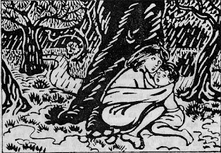
An illustration for Bibhutibhushan Banerjee’s story
On the other hand, he was equally at ease with humorous and comical characters, as was seen in the illustrations for the stories and poems of his father Sukumar Ray. With this kind of illustrations and illustrative books he was doing for the publisher, Signet Press, he was getting famous. With the example of an illustration he did for some of Bibhutibhushan Banerjee’s stories, including ‘Pather Panchali’, Mr. Deb showed how Ray captured the mood, landscape, and the people of a typical Bengal village. Here we can see how he was influenced by the style of his mentor Nandalal Bose. While doing the illustrations for ‘Pather Panchali’, he had the urge to do a film based on this. A few years later, exactly that was what he did and the film was released in 1955. The rest is history, he pointed out.
Even when he did illustrations for the children’s books, including the alphabet learning books, he knew how to use his creativity very much appealing for the children.
On the other hand, he wanted to give a totality and authenticity to the visuals, as seen in some of the advertisements he designed. In one of the advertisements he did for ICI on the occasion of Paludrine Day (Paludrine is an Anti-malarial Drug developed in the 1940s), an elitist joint family is portrayed in all details and authenticity. Even the properties on display in this composition underscore how he closely observed the minute details to bring about the authenticity at the same time highlighting the theme of the advertisement. Ray himself had later said it was a composition that was very ‘filmy’.
By the time he revived ‘Sandesh’, the children’s magazine in Bengali, which his grandfather founded, Ray was totally busy with films, but he devoted time for the magazine. In the very first issue of the magazine after its revival, he used the possibility of types and also the alternative meaning of the word ‘Sandesh’ while designing the cover. Sandesh means news as well as the name of a sweet in Bengal. While he used the typography resembling a horse to write ‘Sandesh’, he also brought in the element of the sweet in it. He was so controlled and confident of the calligraphy that he did this very effectively and he knew that the children would be attracted to it. After all, as a designer, he even developed his own typeface, which highlights his creative talent and craftsmanship. Ray used to regularly change the masthead of the magazine, to make it catchy, amusing and feel-good. It was full of life. As a committed illustrator, he got involved in this magazine. He used varying styles for the illustrations and innovated. Ray did this while he was busy with his films, and this underscores his involvement.
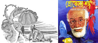
Later, he also started writing stories for children, and developed a character called Professor Shanku. This character is sort of a madcap scientist. The way he wrote the title for this character, using the images of laboratory and geometric equipment, is the finest example of pictography. He developed this character and started writing regularly for ‘Sandesh’ and also illustrated for these stories. Also he was very controlled in dealing with anatomy. Another character he developed was Feluda, which is one of the most popular fictional characters in Bengali literature. He was so much involved with the character that they had many common factors in their own nature. For one story, ‘Trouble in Gangtok’, he did one illustration that was almost like the frame of a film. He did at least 5000 illustrations for ‘Sandesh’, which points to his passion for illustration.
While illustrating a Russian story by Anton Chekhov, ‘Vanka’, which is about child-family separation, and the ordeals of a young boy, we see Ray at his creative best while doing the illustration. Here the boy of nine, who is working as an apprentice with a shoemaker, is writing a letter to his grandpa on Christmas Eve in the hope that he would save him. In the illustration, we see the boy sitting with a candle and his shadow is on the wall in the background. However, on a close observation, we see that the shadow resembles an old man, which reflects the bleak future awaiting the kid. “On one side there is the candle as an image of hope, and on the other side is the shadow resembling a snoopy old man, reflecting the future awaiting the boy, and this way he brilliantly executed the contrast in his illustration,” said Deb, adding that this in one of his best illustrations that Ray did.
Apart from ‘Sandesh’, he did illustrations for some popular children’s magazines including ‘Anandmela’. In one story, about a kleptomaniac (one who has the recurrent urge to steal, typically without regard for need or profit), Ray brilliantly brings to the fore the psychological complexities of the main character in this story. His style is the textbook example as to how illustrations should be done. He was well aware of the light and shade and this added life to his illustrations. With a very few lines, he could be highly descriptive. Even when the printing technology had not developed, and the illustrations were printed using blocks, he had the skill and talent to overcome the limitations through line drawings, using which he even created the effect of light and shade. He knew the power of lines.
Ray’s zeal for drawing was visible in his preparations for the films as well. While doing films, he used to scribble everything and even made drawings, which worked almost like the visual blueprints for the films.


Comments
Post a Comment